Monday, May 9, 2016

Lab 8: Spectral Signature Analysis & Resource Monitoring

Goal and Background

The goal of this lab was to gain experience on the measurement and interpretation of spectral reflectance of Earth surface materials.  Also, to perform basic monitoring of Earth resources using remote sensing band ratio techniques.  We monitored the health of vegetation and soils using simple band ratio techniques.  By doing this lab we are now able to collect and properly analyze spectral signature curves for various Earth surface features.

Photographs and images used in this lab are:

  • Landsat ETM+ image of Eau Claire county and other regions in Wisconsin and Minnesota.
Methods

Part 1: Spectral signature analysis

In part 1 we used Landsat ETM+ of Eau Claire and surround regions.  I measured and plotted the spectral reflectance of 12 materials and surfaces from the image of Eau Claire taken in 2000. 

1. Standing Water 
2. Moving water 
3. Vegetation 
4. Riparian vegetation. 
5. Crops 
6. Urban Grass 
7. Dry soil (uncultivated) 
8. Moist soil (uncultivated) 
9. Rock 
10. Asphalt highway 
11. Airport runway 
12. Concrete surface (Parking lot) 

In order to collect the spectral signatures I drew a polygon within the feature I'm trying to measure.  This is done using the signature editor tool.  After taking the 12 signatures.  A graph is created to show the difference between all 12.  The initial signature is shown below in Figure 1. In Figure 2, is a graph showing all 12 signatures.

Figure 1: The first initial signature of standing water.
Figure 2: All 12 signatures.
We then needed to specify the spectral channel (band) in micrometers for highest and lowest reflectance for signatures 2 through 12.  

 Sig 2, Moving water: Highest is band 1, 0.45-0.52. Lowest is band 6, 0.52-0.90.

Sig 3, Vegetation: Highest is band 4, 0.78-0.90. Lowest is band 3, 0.63-0.69.
Sig 4, Riparian vegetation: Highest is band 4, 0.78-0.90. Lowest is band 6, 0.52-0.90.
Sig 5, Crops: Highest is band 4, 0.78-0.90. Lowest is band 3, 0.63-0.69.
Sig 6, Urban Grass: Highest is band 4, 0.78-0.90.  Lowest is band 3, 0.63-0.69
Sig 7, Dry soil: Highest is band 5, 1.55-1.75.  Lowest is band 4, 0.78-0.90.
Sig 8, Moist soil: Highest is band 5, 1.55-1.75.  Lowest is band 2, 0.52-0.61.
Sig 9, Rock: Highest is band 5, 1.55- 1.75.  Lowest is band 4, 0.78-0.90.
Sig 10, Asphalt highway: Highest is band 5, 1.55-1.75.  Lowest is band 6, 0.52-0.90.
Sig 11, Airport runway: Highest is band 5, 1.55-1.75.  Lowest is band 4, 0.78-0.90.
Sig 12, Concrete surface: Highest is band 3, 0.63-0.69.  Lowest is band 4, 0.78-0.90.

Part 2: Resource monitoring

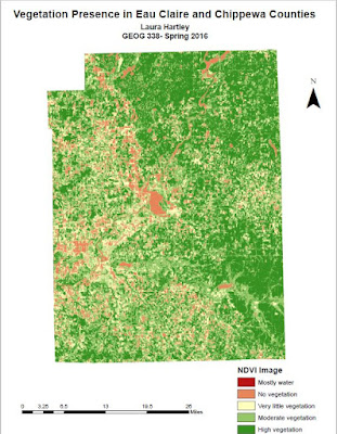
In this section, I performed a simple band ratio by implementing the normalized difference vegetation index (NDVI) on an image of Eau Claire.  This was done in order to look at the vegetation of Eau Claire, by using unsupervised- NDVI.  Another task was done in order to look at the ferrous minerals of the area.  This was done by using unsupervised- indicies.  The results of this are shown in the results section in Figure 3 and 4.

Results

Figure 3: Vegetation in two WI counties.

Figure 4: Ferrous minerals in two WI counties.
These two maps show an inverse relationship between vegetation and ferrous minerals. Overall, this lab was interesting and very informative in how to measure spectral signatures of different features.  I think this will be very useful in future remote sensing projects and the final project.

Data Sources

Satellite image is from Earth Resources Observation and Science Center, United States Geological Survey. 

Monday, May 2, 2016

Lab 7: Performing Photogrammetric Tasks

Goal and Background

The goal of this lab was to introduce photogrammetric tasks on aerial photographs and satellite images.  It specifically focuses on the mathematics for calculating photographic scales, measurement of areas and perimeters of feature, and calculating relief displacement.  It also focuses on stereoscopy and orthorectification.  Stereoscopy is used for 3-Dimensional viewing of an image and uses the science of depth perception.  Orthorectification removes positional and elevation errors from an aerial photograph or satellite image.

Photographs and Images used in this lab are:
  • National Agriculture Imagery Program (NAIP)
  • Digital Elevation Model (DEM) 
  • Digital Surface Model (DSM)
  • Images from Erdas Imagine
Methods

Part 1: Scales, measurements, and relief displacement

In this part of the lab, we needed to measure the scale of an image by using a ruler, measure the area of a feature in an aerial photograph, and calculating relief displacement from an object height.  We needed to calculate the ground distance between two points within in an image.  The equation used was Scale = photo distance/ ground distance.  This looked like, 2.7 inches/ 8822.7 feet which ended up with a scale of 1:39,211.  Next we needed to measure the scale of an image.  For calculating scale we used the equation, S = f / H-h.  Where S= scale, F= focal lens length, H= altitude above sea level, and h= elevation of terrain.  We were given H= 20,000 ft, F= 152 mm, and h= 796 ft.  After calculating that the scale of the image ended up being 1: 39,211.  Next we needed measure the area of a lagoon.  In order to do this we used the measure polygon tool in Erdas Imagine and digitize around the lagoon.  In Figure 1 below is the lagoon that was digitized.

Figure 1: Digitized lagoon to measure area.
The last section of part 1 had us calculate relief displacement from object height.  Using a JPEG image of a smoke stack on the UWEC campus we used the equation d= (h)x(r)/ H.  d= relief displacement, h= height of object (real world), r= radial distance of top of displayed object from principal point (photo), and H= height of camera above local datum.  This turned out to look like this, 1604.5 inches x 10.5 inches / 3980 feet which turned out to be 0.352 inches.  This means the smoke stack needed to be moved 0.352 inches in order to be corrected.

Part 2: Stereoscopy

The aim for this part of the lab is to generate 3D images using an elevation model.  First we needed to look at two images of the Eau Claire area that showed relief displacement. Below in Figure 2 is an example of relief displacement on the UWEC campus.
Figure 2: Relief displace is seen on the image on the left and corrected on the right.
Relief displacement is visible is the image on the left.  We can see the sides of the buildings and they're corrected in the image on the right when we can only see the tops of the buildings.  We looked at these images to get a feel for how relief displacement can alter an image.  Next we needed a pair of polarized glasses in order to finish this part of the lab in order to analyze the analglyph images we generated.  For this section we needed to use the Terrain- Anaglyph tool.  This creates a 3D image and gives us a new way to look at our image.  Once we put on our 3D glasses we can see a difference in the images.  Below in Figure 3 is an example of an anaglyph image.
Figure 3: Anaglyph image is on the left and become 3D with polarized glasses.  The original image is on the right.
Part 3: Orthorectification

This was the biggest section of the lab and introduced us to Erdas Imagine Lecia Photogrammetric Suite (LPS).  This is used in digital photogrammetry for triangulation, orthorectificattion, extraction of digital surface and elevation models, and much more.  We used LPS in order to orthorectifiy images and create a planimetrically true orthoimage.

In the first section we used an already orthorectified image as a source for ground control measurements.  We then created a new project in LPS and began creating ground control points (GCPs).  In Figure 4 below, we can see the already orthorectified/ reference image on the left and the image we're creating GCPs for on the right.

Figure 4: Creating GCPs for the image on the right by using a reference image.
The coordinates of where we needed to create the 12 GCPs were given to us in the directions.  If our points were not within 10 meters of the given coordinates, then we needed to redo the point.  Fortunately, most of my GCPs were correct the first time.  In Figure 4 we can see that nine GCPs have been created and we needed a total of 12.  After creating all 12, we then needed to set the vertical reference system and collect elevation information for all of the horizontal reference GCPs we created in the first section of part 3.  Now that this is done we moved on to the second image in the block.

Now we need to define the Sensor Model in a similar way to what we just did.  We used the GCPs we just collected to create more GCPs in a new image that overlaps the one were just working on.  We only created GCPs for certain point that were in both images.  There were some points that only occurred in one image, therefore another GCP didn't need to be created for these.  Once this was finished we ended up with what it pictured below in Figure 5.

Figure 5: The result of creating GCPs in two overlapping images.
Next, we needed to use tie point collection, which measure the image coordinate positions of GCPs appearing on the overlapping area of the two images pictured above in Figure 5.  By running this process beginning to tie the images together.  Figure 6 below shows the screen after the automatic tie had finished running.

Figure 6: Auto tie completion.
Once the process ran, we needed to ensure that the points were tied in the correct places.  All of the points were in the correct areas so we moved onto triangulating the image.  After this we were almost done.  We just needed to run the Ortho Resampling Process.  This ultimately created the final image that we had been working towards this entire part of the lab.  Below in Figure 7 is the final product of the overlapped images morphed into one.  In Figure 8 is the same image just zoomed in to show how well the GCPs worked in order to create a smooth final product.

Results

Figure 7: The final result of Orthorectification.

Figure 8: Zoomed into the final image to show the minimal difference between the two images combined.
In the end, the two overlapped images turned out incredibly well.  All the work that went in behind this process created a smooth and accurate image.  This is an incredibly useful process that is used in many images.  It can be a long process if many GCPs are needed, but ultimately worth it.

This whole lab was incredibly useful in learning photogrammetric tasks.  It was intense and took quite a few hours to complete it, but ultimately worth it.  I learned many new way to alter images in order to create better results.

Data Sources

National Agriculture Imagery Program (NAIP) images are from United States Department of Agriculture, 2005.

Digital Elevation Model (DEM) for Eau Claire, WI is from United States Department of Agriculture 
Natural Resources Conservation Service, 2010.

Lidar-derived surface model (DSM) for sections of Eau Claire and Chippewa are from Eau Claire 
County and Chippewa County governments respectively.

Spot satellite images are from Erdas Imagine, 2009.

Digital elevation model (DEM) for Palm Spring, CA is from Erdas Imagine, 2009.

National Aerial Photography Program (NAPP) 2 meter images are from Erdas Imagine, 2009.

Wednesday, April 20, 2016

Lab 6: Geometric Correction

Goal and Background

The purpose of this lab was to practice geometric correction.  This was our first time working with the image preprocessing method.  This process is typical done before any information can be extracted from an image.  Geometric correction is performed because many satellite images are not collected in their proper planimetric position, also known as coordinates.  It does away with most of the distortion in the original satellite image and creates a more accurate images that we can use to extract reliable and accurate information.

In this lab we used:

  • USGS 7.5 minute digital raster graphic image of the Chicago Metropolitan Statistical Area to correct a Landsat TM image of the same area.
  • Landsat TM image for eastern Sierra Leone to correct a geometrically distorted image of the same area.

Methods

Part 1: Image-to-map rectification

In the first part of this lab we worked with the Chicago area.  We had a raster image that we needed to geometrically correct and a reference image which was a topographic map.  Two views were opened in order to view both images at once.  The distortion was visible, but not greatly so.  In order to create ground control points (GCPs) we needed to click on the Multispectral tab in order to activate the raster processing tools for multispectral imagery.  From here we chose the Control Points option.  We needed to click through some windows that opened in order to set parameters for the image.  Most of these we kept as their default settings.  One window that pops up tells us what coordinate system the images is in and it also says "model has no solution".  This means we need to add GCPs in order to create a solution for the model.

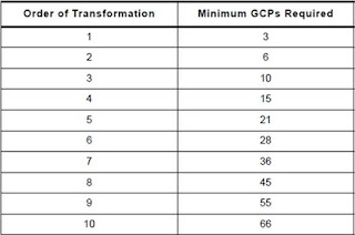
After clicking through multiple windows, we are now in the Multipoint Geometric Correction window.  On the left is the Chicago satellite image that needs to be corrected.  On the right is the Chicago reference image that is in the proper planimetric position.  Now we needed to create a minimum of three GCPs for this image because it has a 1st order of transformation.  There are different orders of transformation and in order to decide on which fits for an image we need to determine how many GCPs are needed in order to have a total RMS error below 1.  In the case of the Chicago images we need a minimum of three GCPs which means it is the first order of transformation.  Below in Figure 1 is a graph that was used in order to help determine that answer.  Also below in Figure 2 is how the two Chicago images were seen in the Multipoint Geometric Correction window.

Figure 1: Order of transformation table to help determine the minimum GCPs required.

Figure 2: Left satellite image of Chicago to be geometrically corrected. Right image of Chicago for a reference.

We created four GCPs which created the dialogue stating "Model solution is current".  In the results section is Figure 3 which shows the four GCPs and the total RMS error which is below 2.0.  Now that the image is geometrically corrected we needed to save the new image.  Also in the results section is Figure 4 which are side by side images of the original Chicago image and the corrected image.

Part 2: Image to image registration

For our next task we needed to geometrically correct and image with a reference image rather than a reference map like we used in part 1.  We imported the images in the same manner as in part 1, except for one part.  The Polynomial Model Properties window lets us choose the polynomial order for the image which sets the minimum amount of GCPs required to get the dialogue "Model solution is current".  Instead of a 1st order like we did in the part 1, we set it to the 3rd order.  This means we need a minimum of 10 GCPs in order to correct the image.

We created a total of 12 GCPs for these images and then made sure the RMS error was below 1, with below 0.5 being ideal.  In Figure 5 in the results section is an image of the twelve GCPs along with the total RMS error of 0.26.  One other thing we did differently with part 2 was when we saved the newly corrected image.  Instead of choosing nearest neighbor for the resampling process, we chose billinear interpolation.  We used this because it produces a more accurate image rather than using nearest neighbor.  The result of this correction is seen in Figure 6 in the results section.

Results

The Figures talked about earlier in this post are picture below here.

Figure 3: Four GCPs for the Chicago area with a total RMS error of 0.026

Figure 4: The original Chicago image is on the left.  The geometrically corrected image is on the right.

Figure 5: 12 GCPs for the Sierra Leone image with a total RMS error of 0.26.

Figure 6: The original image of Sierra Leone is on the left.  On the right is the geometrically corrected image.
I found that getting the total RMS error below 0.5 not to be very hard once I got the hang of how this process works.  In Figure 4, it is quite hard to tell the difference between the two images because they were not that different in the first place.  But, in Figure 6 there is quite a big difference.  The end image (on the right) turned out a bit distorted on the upper left portion.  I believe this is because most of my GCPs were focused in other areas.  If I could do it again I would put more GCPs in that area to get a more accurate and better looking result.  Also, it is quite obvious that some of the clarity was lost in the final image.  I don't know exactly as to why that is, but I am assuming it has to do with the type of interpolation that chose for that image.


Conclusions

Overall, this lab taught us a very valuable skill.  Given that many satellite images a not in their proper planimetric position, geometric correction needs to be done quite often.  Once it is practiced a couple of time the process becomes more understandable and practical.  It is vital to use this tool in order to get accurate data in the final product.

Wednesday, April 13, 2016

Lab 5: LiDAR Remote Sensing

Goal and Background

The main goal of this lab is to get basic knowledge of LiDAR data structure and processing.  This includes the processing of numerous surface and terrain images and then processing and creation of intensity image and other products from point cloud.

This is our first time working with LiDAR data and getting to know our way around using it.  LiDAR stand for light detection and ranging.  This method takes light in the form of a pulsing laser the measure ranges to Earth.  This data combined with other various data can help to generate 3D information about the shape of the Earth the characteristics of our planet.

Methods

Unlike our other labs, most of this lab was done in ArcMap instead of Erdas Imagine.  For the first part of the lab we needed to do a quality check of the LAS dataset we are given.  This entails checking the metadata and making sure everything looks correct.  After doing so, I had to create a new LAS dataset, this keeps the data organized and easily accessible when working with it.  Because we created a new dataset this means we need to build the statistics of the data.  The data already has statistics associated with it, but the new area does not have this data unless we calculate it.  Though, ArcCatalog does make this quite easier.  With the push of the 'calculate' button, all of the statistics are now in the LAS file.  The calculate button is sometimes too good to be true so we need to check the statistics to make sure they are correct.  The best way to do so is to check the elevation.  If the elevation is in the same range as the area the LiDAR data is taken of, then it's good to move onto the next step.  Our statistics are good so it's onto the next step.  Now we need to set the coordinate system for the data.  No coordinate system was imported with the LAS files so we need to look at the original to see if one of those files has the coordinate system the data was taken in.  It in fact does and now we need to transfer this to the new data.  Everything is set in ArcCatalog and it's time to move into ArcMap to actually work with the data.  

Once in ArcMap I imported the LAS dataset which is displayed in tiles until you zoom in to a certain extent and the LiDAR points are revealed.  I also added a shapefile of Eau Claire county to get a better grasp of where everything is.  Next I had to activate the LAS Dataset Toolbar in order to visualize the point clouds and generate different products for the next section of the lab.  I explored the different options I could change the map to look like.  For example, elevation, aspect, slope, and contour.  I also changed the filters that were available.  Here I couuld change which returns I wanted to see and which classes I wanted to see (ground, vegetation, building, water, etc).  After playing around with those options for a while, I moved onto creating two different rasters.  I created multiple DSMs and DTMs.  Figures 1 and 2 were created using hillshade.  Figure 1 shows the Eau Claire area with buildings and vegetation.  Figure 2 takes away all of that and just shows what the ground looks like without it all.  It was incredibly interesting to see what differences buildings and vegetation can make it a simple LiDAR image.  Figure 3 shows a LiDAR intensity image.  The intensity image shows the first return points from LiDAR.

Results

Below are the images I created using different tools throughout this lab.

Figure 1: Hillshaded image of the Eau Claire area.
Figure 2: Hillshaded image of Eau Claire without buildings or vegetation 
Figure 3: LiDAR intensity image

Conclusions

It was very interesting to see another side of remote sensing by learning about LiDAR.  I didn't know how diverse this area of study could really be.  I would like to learn more about LiDAR and all of it's capabilities.  I would also like to see if there are any health risks involved with the LiDAR lasers that are being sent down.  It will be interesting to see where LiDAR goes in the future and how it develops.

Friday, April 8, 2016

Lab 4: Miscellaneous Image Functions

Goal and Background

The main purpose of this lab is to:

  • Define a study area from a larger satellite image
  • Learn how spatial resolution of images can be enhanced for visual interpretation purposes
  • Work with new radiometric enhancement techniques
  • Linking satellite images with Google Earth 
  • Learn methods of resampling satellite images
  • Practicing methods of image mosaicking
  • Learn binary change detection with the use of simple graphical modeling
Working with and learning these new skills are vital to the study of remote sensing.  These skills are practiced by using the ERDAS Imagine software.

Methods

Part 1: Image subsetting
  • The first part of this lab worked with image subsetting and creating an area of interest (AOI) for a study area.  The AOI was created through using an inquire box.  The box was placed around the Eau Claire area and the subset was created.  This subset is pictured in Figure 1 below.
Figure 1: Eau Claire subset
  • Next we created another subset, but we used a shape file in order to focus on a more specific AOI.  This was done by adding the shape file to the original raster that was used for the first subset.  The focused subset that was created is pictured below in Figure 2.
Figure 2: Eau Claire subset created with a shape file

Part 2: Image fusion
  • In this section of the lab I created a higher spatial resolution image from a coarse resolution image.  This is done in order to enhance the image spatial resolution for visual interpretation functions.  First, I used the resolution merge tool in order to enhance the resolution from 30 meters in a reflective image to 15 meters from a panchromatic image.  This process resulted in a pan sharpened image with a resolution of 15 meters.  These three images are pictured in Figures 3.1, 3.2, and 3.3 below.
3.1: Panchromatic image, 15 meter resolution.
3.2: Reflective image, 30 meter resolution.
3.3: Pansharpened image, 15 meter resolution.
Part 3: Simple radiometric enhancement techniques
  • This section focused on haze reduction in images.  I used the haze reduction tool and it enhanced the color of the image and overall clarity of it.  This tool is useful, but the resolution is not enhanced with the haze reduction. The original and haze reduced image are picture below in Figures 4.1 and 4.2.
Figure 4.1: Original image with haze.

Figure 4.2: Haze reduced image.
      
                                                                                              
Part 4: Linking image viewer to Google Earth
  • I thought this part of the lab was very interesting.  It really showed the difference a high resolution satellite can make.  I opened an image of the Eau Claire area in ERDAS Imagine and opened another window that connected to Google Earth.  I synchronized the views and zoomed into where my house is in Eau Claire.  The image in ERDAS was completely pixelated and I couldn't make out any objects or significant features.  In the Google Earth window I could see my house clearly with no pixelation.  Google Earth uses GeoEye high resolution satellites and it's incredible the difference those satellites can make.  Zoomed out to their full extent these images look the same, but once you zoom in the differences are immediate.
Part 5: Resampling
  • In this section I resampled an image with two different methods, nearest neighbor and bilinear interpolation.  The nearest neighbor and bilinear interpolation methods did not create a very noticeable difference compared to the original image.  The two processes had the pixel size changed from 30x30 to 15x15, which I thought would have made a big difference, but in the end the difference was not very noticeable unless you know what you're looking for.  I also debated about putting the three images in this blog post, but the differences are so indistinguishable at a large size that I decided not to include them.
Part 6: Image Mosaicking
  • Two different types of mosaicking were used in this section, Mosaic Express and Mosaic Pro.  Mosaicking is basically taking two or more images and stitching them together in order to create on big image.  Mosaic Express is a quick and easy way to create one full image, but the final product does not look professional.  In order to get a better image I used Mosaic Pro.  This takes more effort and decisions to create, but ultimately the picture looks better overall and gives the user a better look at the two images as one.  The two mosaics are pictured below in Figures 5.1 and 5.2.
Figure 5.1: Mosaic created with Mosaic Express

Figure 5.2: Mosaic created with Mosaic Pro
Part 7: Binary change detection (image differencing)
  • In the last section of the lab we used the model building tool.  The tool was quite simple and helped create the map pictured in Figure 6 below.  I inputted a map from August of 1991 and entered an equation to create an output to show pixel differentiation from August of 1991 to August of 2011.
Figure 6: Pixel changes from 1991 to 2011
Results

Pictured below are the images I created throughout this lab using different tools.

Figure 1: Eau Claire subset
Figure 2: Eau Claire subset created with a shape file


3.3: Pansharpened image, 15 meter resolution.
Figure 4.2: Haze reduced image.
Figure 5.1: Mosaic created with Mosaic Express


Figure 5.2: Mosaic created with Mosaic Pro


Figure 6: Pixel changes from 1991 to 2011


Conclusions

This lab really helped me learn more of the basic techniques used in ERDAS Imagine and in the study of remote sensing.  Knowing these simple tools allows me to critically look at remotely sensed images while also altering them in order to get the information I need.